App Builder
Topics in this document:
To access this section in EV Charge, from the Menu, select System configuration, and click App builder.

Library
To access this section, click App builder. A list of all created application templates is displayed in a table, showing their Name, Status (e.g., Published or Draft), and creation date.

Figure 1: App Builder template library
You can use the search bar at the top to filter the templates by name. For each template, you can view or modify its specific configuration by clicking the View/Edit icon.
To create a new app template, click + Template. This will open a modal where you must enter the template name. After creating it, you can begin configuring its layout.

Figure 2: Add template modal
Dashboard
After selecting a template via the View/Edit icon, you will enter the builder interface.
The center of the screen features a visual Phone Emulator. This area dynamically represents the application’s user interface, displaying an approximation of how the configured widgets and footers will appear on a mobile device.
The emulator screen is divided into three areas where widgets can be placed:
- Top – A supplementary area displayed above the main content, typically used for search bars, filters, or custom HTML banners.
- Center – The primary content area. This is the main view users see when they open a screen in the live app (e.g., the station list, map, or account overview). Widgets placed here form the core of the screen’s functionality.
- Bottom – A supplementary area below the main content, used for additional controls or custom elements.
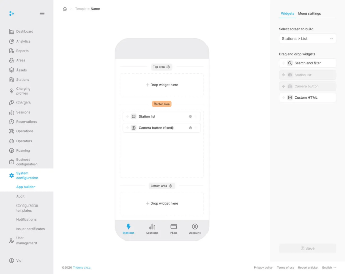
Figure 3: Phone emulator interface
Builder interface
The right sidebar contains the primary configuration tools organized into two tabs: Widgets and Menu settings.
Widgets
The Widgets tab allows you to customize the content of individual screens in the app.

Figure 4: Widgets tab configuration
- Select screen to build: Use the dropdown menu to choose which specific app screen to configure (e.g., Stations > Map, Stations > List, Account, Sessions).
- Drag and drop widgets: Below the screen selection is a library of available widgets for the selected screen. Drag and drop them into the corresponding areas (Top, Center, Bottom) on the Phone Emulator.
- Examples for Stations List include: Search and filter, Station list, Camera button, Custom HTML.
- Examples for Account include: Car list, Card list, Settings, Delete account.
Once a widget is added to the phone emulator, you can configure its placement and behavior by clicking the Settings icon directly on the widget.

Figure 5: Widget settings configuration
The right sidebar will display specific configuration fields for that widget type:
- Position: Set relative horizontal and vertical positioning (left, right, top, bottom as percentages).
- Padding and Margin: Adjust the inner and outer spacing of the widget in pixels.
- Label: For certain widgets, you may adjust the displayed label text.
To delete a widget, click the Delete icon on the widget in the emulator.
Menu
The Menu tab is used to configure the app’s bottom navigation footer.

Figure 6: Menu settings tab configuration
- Active Menu Tabs: You can reorder and manage the tabs that are currently visible to users in the app’s footer (limited to a maximum of 5 active tabs).
- Unused Menu Tabs: Shows available features and screens that are not currently included in the bottom navigation. Drag items here to hide them from the footer.
You can also configure the settings for the structural areas in the emulator. In the emulator, click the Settings icon near the “Top area” or “Bottom area” labels to adjust properties such as making the area “Always visible”.

Figure 7: Menu settings configuration
After making all necessary changes, click the Save button to apply the modifications to the app template.

Figure 8: App builder save configuration